|
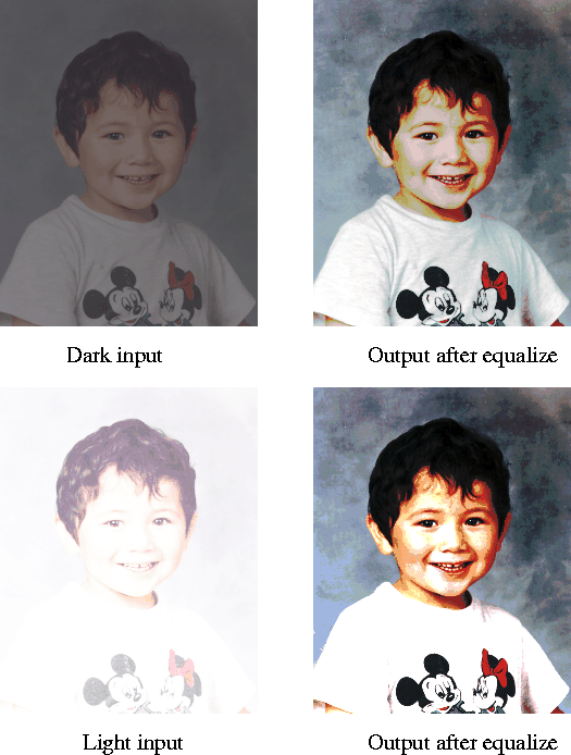
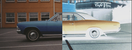
Image MenuThe Image menu offers some of the most useful image manipulating functions in Gimp. In this chapter we're going to discuss what you can do with Map, Adjust and Channel Ops. MapMapping deals with how image pixels are mapped to different RGB values. The sub menu under Map consists of Equalize, Invert, Posterize and Threshold. EqualizeEqualize is often used to correct over- or under-exposed photos. This command finds the darkest and lightest pixels in the image, and sets the darkest value to black, and the lightest to white. The intermediate colors are then translated to the correspondent histogram values on the new scale. By doing this, it equalizes the image pixels on a wider scale or spectrum than before. The result is usually harder and much clearer, with more saturation and contrast but often less fine detail. Equalize can be used to find "hidden" colors in old, fading photos, because colors are also equalized. If there is a weak shade of green somewhere in a seemingly solid blue area, equalize will find it and strenghten it, while the blue color will lose in intensity. Sometimes this behaviour means that colors will look a bit unnatural after equalization, so you might have to correct it further by using the Image Adjust commands. For adjusting old photos, it is sometimes better to use "Autostrech HSV", "Contrast Autostrech" and "Normalize" in the Filter/Image menu. You'll have to try all and see which is most suitable for your picture.
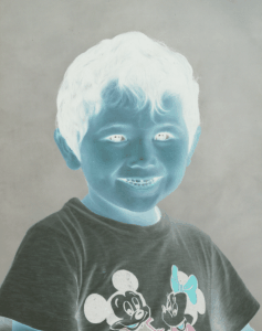
Invert
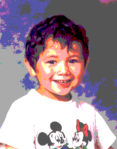
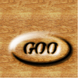
Posterize
For a grayscale image it's easy. Level 0, 1 and 2 produce the minimum of colors possible - black and white only. For each level you get one more grayscale. Level 4 equals four shades of gray, level 16 equals 16 shades of gray etc. In an RGB image, Level 4 equals four different shades in each color channel. This means that level 4 equals 4*4*4, which is 64 colors. Because those 64 colors have nothing to do with the original colors in the image, only a few of them will be used in the image. A posterized image will be a lot less representative, but (perhaps) more "artistic" than an indexed image, where the chosen colors are taken from the image. Threshold
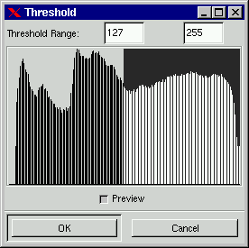
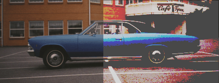
Clicking on a single spike will only display pixels with that particular value, while dragging from one spike to another, will display all pixels with a threshold range from the first value to the second.
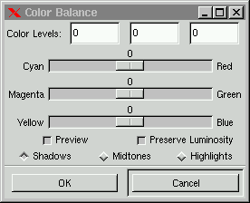
AdjustAdjust deals with image correction. You can adjust color, contrast, brightness and saturation of the entire layer or a selection. The Adjust tools are Color Balance, Brightness-Contrast, Hue-Saturation, Curves, Levels and Desaturate. Color Balance
In the dialog box you'll find three slide bars ranging from the three RGB colors to their complimentary colors (CMY). As you know if you have read the chapter about color, the sum of two complimentary colors is neutral gray. You can consider your current pixels "neutral" and any change you apply will draw the pixel color either toward Red or Cyan, Green or Magenta, Blue or Yellow. Note, that drawing all three slide bars against the CMY (additive) colors will darken your image, while drawing them toward the RGB (subtractive) colors will lighten the image. There are also three buttons for Highlights, Midtones or Shadows. By pressing one of these buttons , you choose whether you want to change the darkest pixels, the medium pixels or the brightest pixels. The Preserve Luminosity button makes sure that the brightness value of your image doesn't change. By default this option is unchecked, the colors can get very unnatural looking if you insist on keeping the original values while changing the color balance.
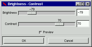
Brightness-Contrast
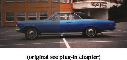
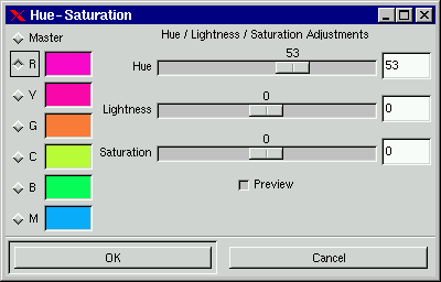
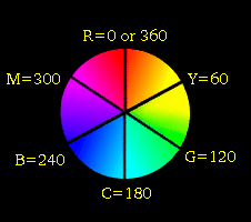
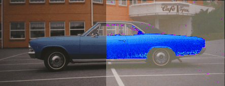
Hue-Saturation
When you change Hue with the Master button checked, all pixels in the image or selection will change color according to how many degrees you have turned the HSV color circle. If you just want to change part of the spectrum, you can choose one of the color swatches.
Because this is HSV, the Hue/Saturation Yellow swatch starts at 100 % pure yellow on the HSV color circle (no orange shade whatsoever allowed) and continues toward Green. Everything in the yellow-green cake slice is affected by changes to hue, saturation or value. Yellow pixels get the color you see in the swatch, and greenish pixels get the color next (clockwise) to the swatch color, more and more so the greener they get. To affect the yellow pixels which were slightly to the red side, choose the red swatch instead. The red swatch changes all color between pure red and yellow. This fact can make Hue-Saturation difficult to work with, and unsuitable for some images. It's useful for most images, but if you have trouble with it, try the excellent "Colormap Rotation" in the Filters/Darkroom menu instead (there are very few things you can't achieve with that filter).
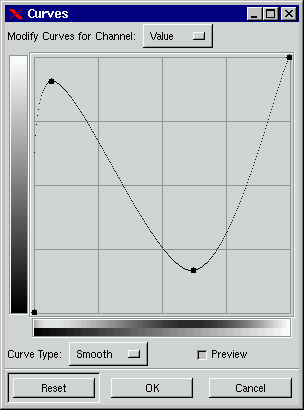
CurvesThe Curves command is a fantastic instrument for changing color and brightness of an image or a certain color/brightness range in an image. As a matter of fact, it's so versatile that it is hard to describe in a way that makes sense.
Simply put, the image's RGB values (and possible Alpha values) are represented by curves, and you can change a curve anyway you like by dragging at different parts of it.
Remember the Threshold command? When you looked at your image with Threshold, you could choose an area from spike A to spike B, and that area represented pixels of intensity A, ranging to intensity B. It is the same way with Curves; The left part of the curve represent the darkest pixels in the image, and the right part represents the lightest pixels. There is a grayscale gradient to the left of the curve. This gradient tells us what brightness value the curve follows. To understand Curves better, you have to open an image and try it. Try dragging at the middle of the curve, up to the left, and down to the right. While you are doing this, take a look at the gradient below the curve. First of all, you'll find that dragging down makes your image darker, and dragging up makes it lighter. Remember that you dragged in the middle of the curve. The middle represents pixels with midvalues. By making a soft curve in this fashion , you have changed the midvalues a lot, but you have only changed highlights and shadows a little, so you have less contrast now. If you check out the lower gradient, you'll see that the balance of dark and light has been changed, you can also see where on the scale this happened and with how much. If you are in a color channel, this procedure will turn pixels a lot more/less (green/red/blue). In a Color channel "dark" means pixels with little of that color, and "light" means pixels with a lot of that the color in them. If you are changing Alpha, it's the same - dark stands for low Alpha value (or very transparant). You may have noticed that there are two dots at the ends of the curve. Drag at these dots. You'll find that the line to the left/right of the dots is perfectly straight. In practice, this means that dragging the left dot constrains a range of dark pixels to the same value. How large this darkness range or interval will be depends on the horizontal length of the line. How dark it will be depends on where you put the dot on the vertical scale. Click at different places on the curve. Each click produces another dot, and you can move each dot independently of the others. You can move them up, down or along the curve. These dots are like Bezier tool anchor points, but without the handles. This means that by moving a dot, you'll produce a little curve between the two neareast dots. This way you can easily pick a suitable pixel range, and only change the values within that range. To get rid of dots, drag them toward one of the end dots. You can choose to get rid of all dots exept one, but having only one dot means that your curve is flat. A flat curve causes all values to be the same; and this means your image will turn gray and disappear (or, if you're in the red channel, all pixels will get the same red value). Because this is a Value based on RGB, you can sometimes get an unwanted color change where you only wanted to change the pixel brightness. This happens when you try to make extreme changes, like turning a very dark object light, without disturbing the other colors in the image. Doing this will only invert the color, and you'll just end up with something red if the object was green. There are many solutions to this problem. You can for example isolate the object in a selection and use Value Invert in the Filter/Image menu. This filter works in HSV space, and inverts Value without changing Hue or Saturation. The option "Curve Type: Free", lets you create or modify your curve with a pencil, which offers unlimited possibilities of fine-tuning colors or values. Pressing Smooth will get you back to a smoother version of the same curve. To learn more, you have to experiment with it by yourself. Levels
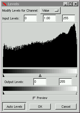
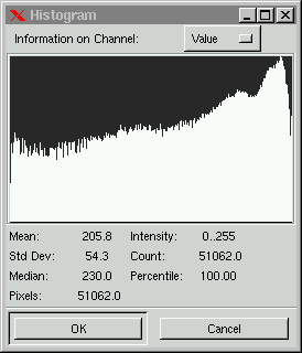
When you open the Levels dialog, you'll see a histogram of your image's Value (all RGB Channels) or of the Red, Green, Blue or Alpha Channel. Take a look at the histogram and the little arrows beneath it. The black arrow represents minimum value in the RGB channels, the white arrow represents maximum value and the gray arrow represents the mid value (127 on the RGB scale). The area between the black and white arrows define a certain pixel value range. If you're working with a grayscale image, every pixel to the left of that range turns black, and everything to the right of it turns white. Within that range you can decide how the brightness value is going to be distributed through the transition from light to dark. If you're working with an RGB color image, the areas outside of the range will consist of the primary colors and their derivatives (CMY, RGB, BW). If you drag the black arrow to the start of the histogram, the white arrow to the end of it and put the gray arrow in the middle, you have pretty much done the same thing as Equalize does, i.e. broadened the spectrum of the image. If you keep moving the arrows toward the centre, you'll get more contrast and less detail, because the range is narrowing down. Try and move the gray arrow. Moving it to the left adjusts the brightness scale so that more and more of the pixels get brighter, and vice versa. Also try the Output levels gradient. The output levels control the overall brightness value, the entire image or drawable gets darker or lighter - always with less contrast than before.
Levels on RGB or Alpha: When you switch to a color channel, you must remember that we're no longer talking about dark and light, we're now discussing the quantities of color in the image. Dark in the grayscale gradient means low values of the color in questions, and light is for pixels with a lot of that color in them. The outcome of moving the arrows in a color channel isn't as obvious as with Value, it depends on how much there is of the color, and in what range most of the color is placed. The Output gradient controls the value range pixels are allowed to use for a certain color. By this I mean if you set the Output to 100 - 120, all pixels with a little green in them, (even if it's a very low value) get a new green value, which is at least 100, and no pixel gets a higher value for green than 120. Dragging the white arrow to the left causes the image to get less green (i.e. more red), and vice versa for the black arrow. What is true for the color channels is also true for Alpha. Here, dark means low Alpha (transparant) and white is high Alpha (fully opaque or solid). When you use Levels on Alpha, you should use it for advanced selections from an Alpha Channel or a Layer Mask, i.e a selection with great variation of Alpha values. Otherwise it will be a bit like trying to use Levels on a solid white square on black background - there isn't really much you can do with it. Example: Making Carved Text with Levels To make you understand what Levels are good for, check out this example.
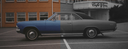
DesaturateWith Desaturate you can choose to remove color from a layer or selection without disturbing the rest of the composite image. Desaturate does not turn your image into a grayscale, it's still RGB, even if there is no visible color.
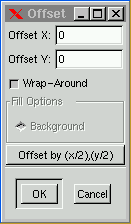
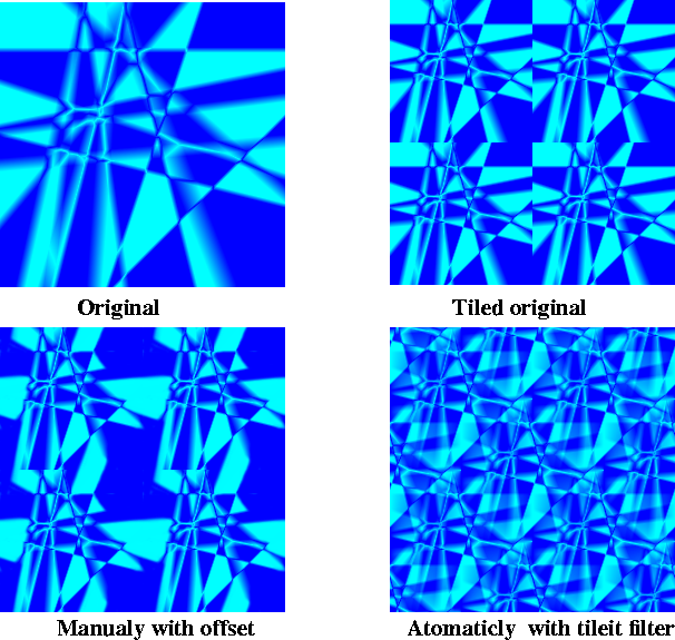
Channel OpsThe Channel Operations deal with channels , but in very different ways. Duplicate includes all layers and channels in a composite image, while Offset only affects the active layer/channel. Decompose uses channel information from the active layer and creates new grayscales, and Compose transforms grayscales to channels, thereby creating a new RGB image. DuplicateDuplicate creates a copy of your image. This is a very useful command, make sure you use it every time you want to experiment with different solutions and variations in an image. Offset
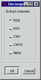
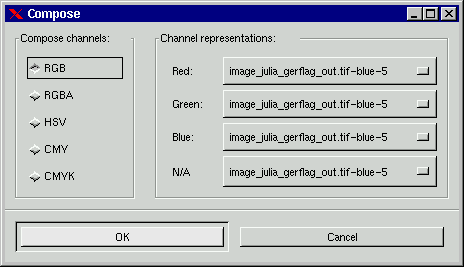
Compose and Decompose
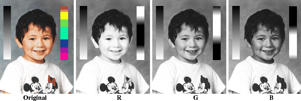
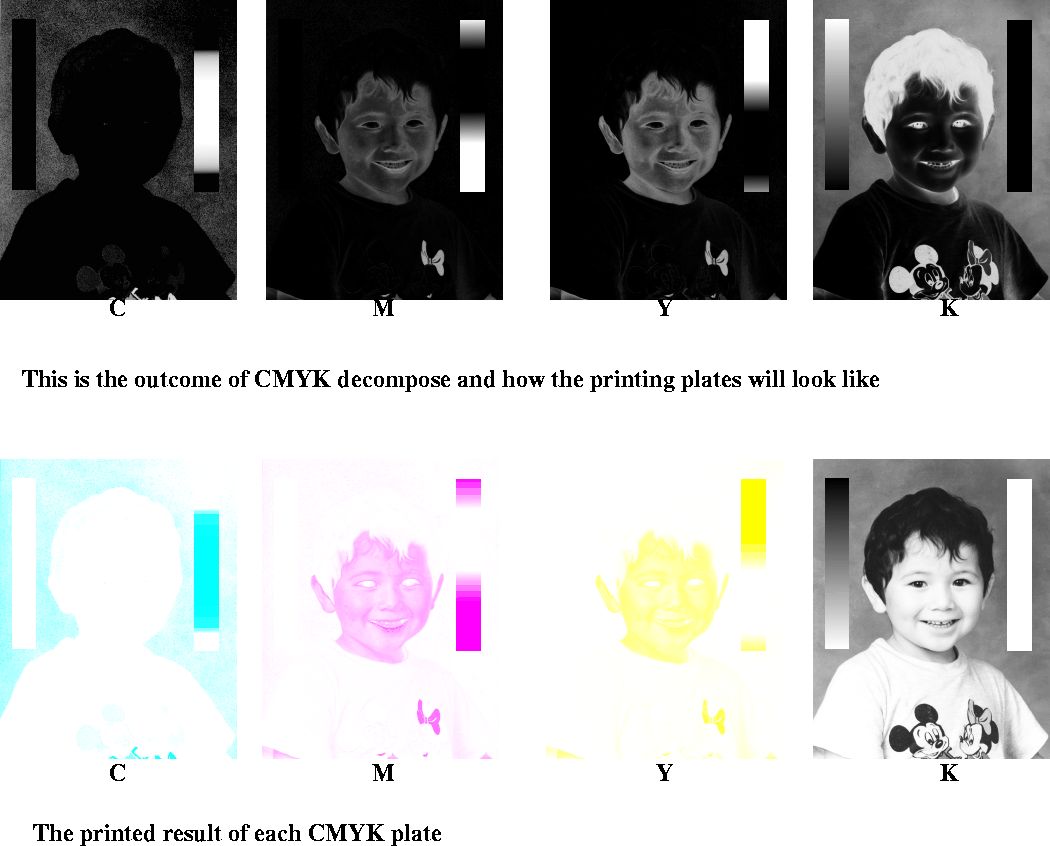
Decomposing to RGB is really the same as activating a color channel in the Layers & Channels dialog, but now you'll get them as three different grayscale images. You can do a lot of things with decomposed images. The first thing that comes to mind is to edit them in different ways, and then use Compose to put them together again. Another way of using Decompose is to save an extracted grayscale as a selection or mask in a channel. Sometimes there is very litte of a certain color in the background compared to an object in the image. This gives you the perfect opportunity to create very exact selections of intricate objects. You can also play around with compose/decompose, and create interesting patterns.
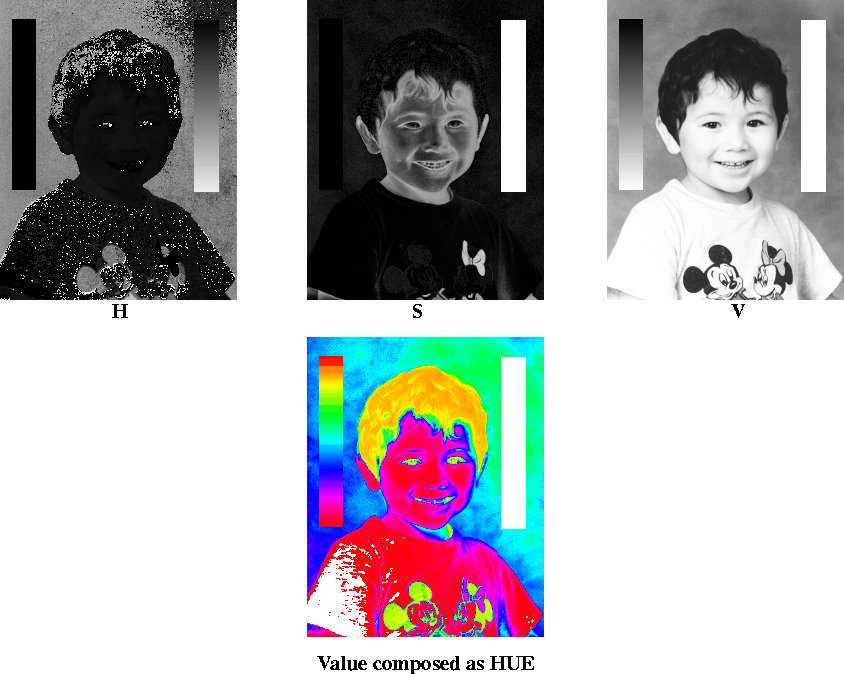
The HSV decompose option creates three different grayscales, one for Hue, one for Saturation and one for Value. It may seem strange that a grayscale image can describe color, as in Hue, but consider the HSV color circle. Imagine a circular gradient where white and black meet in the start and ending point on the circle. Black and white represent red, which is on top of the HSV color circle. Dark gray equals orange or yellow, and medium gray tones represent green or cyan. Accordingly, light grays represent blue and magenta. The Saturation and Value grayscales are easier to understand. White represents pure, strong color (saturation) and maximum brightness (value). Black means completely desaturated gray(saturation) and, well, black (value). From this we can derive, that if you want something to be white in a HSV based image, Saturation in that area must be set to black, and Value to white. The big difference between RGB compose and HSV compose is that the grayscale information means very different things for Hue, Saturation and Value, while gray in RGB channels just represents the concentration of a certain color. This also explains why it is possible to manage with just one grayscale, when you are composing to HSV. If you were to use the same grayscale for composing RGB, the result would be exactly the same as the original grayscale. If you did the same for CMYK, you'd just end up with an overbright negative of the image ( if the image was inverted you'd get a very dark grayscale).
The CMY or CMYK decompose option is interesting if you are thinking of putting your work to print. Using CMYK decompose is actually the same as making your own color separation for four-color printing plates. In principle, you can use CMYK decompose, print the outcome ona laser printer, and give it to a professional printer's shop. However, the professional printer would most likely do a much better separating job than you can, so I don't recommend this solution. You can certainly achieve very interesting results with CMY/CMYK decomposed images, even if you don't use them for printing purposes.
Alpha decompose is a fast and easy way of converting semi-transparant layers to the equivalent grayscale. You can certainly do the same thing if you copy and paste the layer to an Alpha channel or a Layer mask, but with Alpha compose/decompose you don't have to worry about copy/paste to Channel, or transforming to selection and filling when you want it back in the layer again. It's a real convenient way to edit Alpha layers, and a worthwhile alternative to editing in the Channel's menu. Another great advantage is that decomposing an Alpha layer twice (Alpha decompose as well as RGB decompose) allows you to retain original structure, color and Alpha after editing, because you can compose to RGBA, which includes all channel information. RGB, Grayscale, Indexed
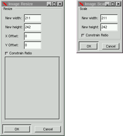
Resize and ScaleThe major difference between Image Resize and Image Scale is that Resize only changes the canvas size, while Scale changes the actual size and scale of your image. Note that when you enlarge your image with Scale, Gimp interpolates the new image. Interpolation means that an additional pixel between black and white original pixels will get a gray color. This means that the enlarged image will look better than the original image if you zoom the original to the same size, but it will also lose in sharpness and clarity. Scale makes everything in your image larger or smaller, including layers, but Resize doesn't change the size of the layers. To do that - use the Resize Layer option in the Layers menu. You have to change the layer size if you mean to use the new canvas in a meaningful way (unless you're happy with the layers you have, and only wish to use the new size for new layers). You can determine where on the canvas you want to place the image by using X- and Y Offset. The dialog window gives a preview of what the proposed changes in size or offset will look like, and you can choose to keep the proportions of the old image by checking "Constrain Ratio". If you uncheck Constrain Ratio and then change the proportions, Scale will stretch or compress the image to fit the new size, thus distorting the image. Resize will never distort the image, it will either crop or add a tranparant area to the image to fit the new size.
Histogram
[Top] [Prev] [Next] [Bottom] karin@frozenriver.ale.se Copyright © 1997, Karin Kylander |
|||||||||||||||||
|
With any suggestions or questions please feel free to contact us | ||||||||||||||||||