
| О КОПИРАЙТАХ |
| Вся предоставленная на этом сервере информация собрана нами из разных источников. Если Вам кажется, что публикация каких-то документов нарушает чьи-либо авторские права, сообщите нам об этом. |
|
|
|
|
[Top] [Prev] [Next] [Bottom]
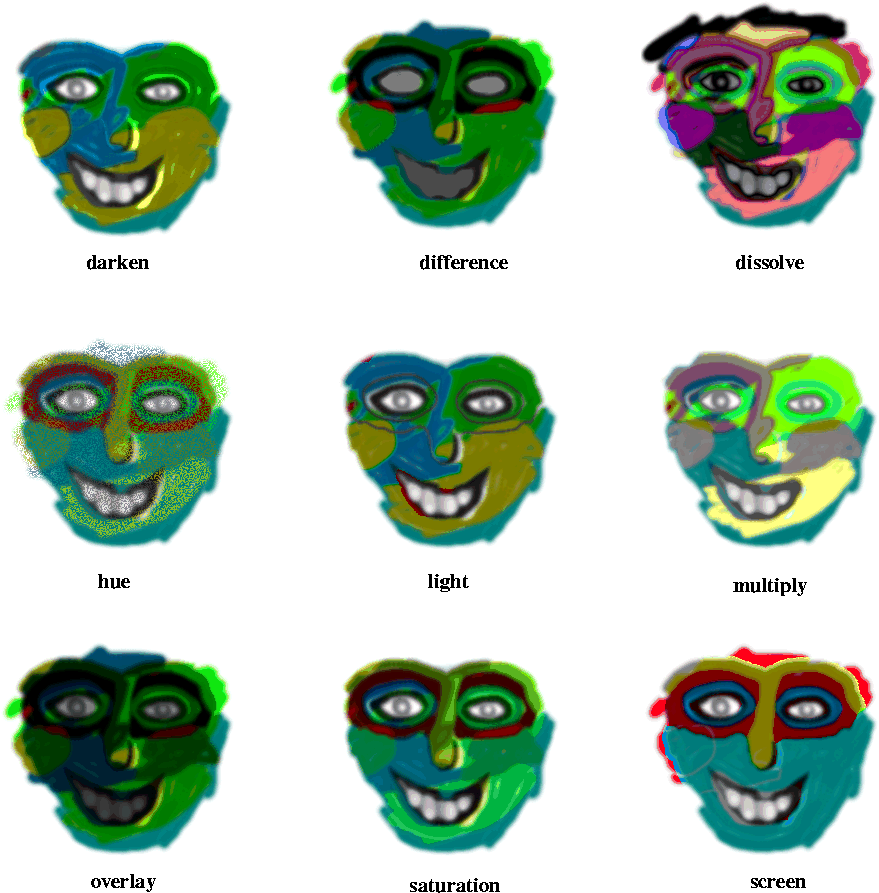
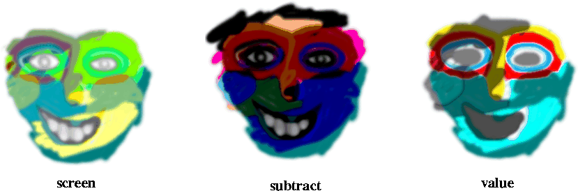
Modes
Modes
Blending modes or Transfer modes can be described as different ways of controlling how the pixels in a foreground layer blend into the background layer(s). Modes is something you mainly use with layers, but they can also be used more directly as paint modes with the Paint bucket, the Blend tool or any tool which uses Brush Selection. There are 14 different modes in GIMP;
- Normal
- Dissolve
- Multiply
- Screen
- Overlay
- Difference
- Addition
- Subtract
- Darken Only
- Lighten Only
- Hue
- Saturation
- Color
- Value
Normal Mode
Normal Mode doesn't do anything special, as you might expect. The normal mode layer covers all other layers, unless there are transparant or semi-transparant areas in it.
Dissolve Mode
Dissolve Mode is actually very similar to Normal Mode. You must move the Opacity slide bar and make the layer transparant to be able to see the effect. When in Normal Mode at 50% opacity, you'll see a smooth semi-transparent surface, Dissolve Mode will produce a dotty, grainy looking surface. Instead of using semi-transparent pixels, Dissolve Mode produces entirely opaque or entirely transparent pixels, 50% of each (if that's the opacity value). This mode creates noise effects similar to grainy film or granite rock. If you want a transparent GIF to look semi -transparent, using dissolve is the only way you can achieve something of the kind. As you may know, GIF:s only go two ways - transparant or non-transparent pixels. However, this isn't a great solution. Most likely, your glowing text or whatever, will look infinitely better with a solid background, indexed to match the background on your page.
Multiply Mode

Multiply Mode amplifies shadows or dark areas of the image. Multiply is the mode for creating shadows. You may compare it to putting two slides on top of each other on a fluorescent clipping board. As in a slide, white areas are transparant in this mode, and as putting together two slides would - the result is always darker. As to colors, they also react as layers of colored glass (or if you prefer, CMYK color, yellow+magenta=red).
Screen Mode

Screen Mode is the opposite of Multiply. In this mode, black is transparent and the result is always lighter. Screen is the mode for creating highlights in an image. In screen mode, white covers all, gray shades get more transparent the darker they get, and color is only visible if the background color permits it. You will not see the background color (exept for through black or transparant areas)but it will certainly affect the foreground colors. Against a stark red background, only the yellow/red spectrum is visible. For subtler colors this won't be so evident, but the colors will tend to go towards the BG-color (Now we are talking RGB color, yellow + magenta = white, just as on your computer monitor or television set).
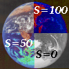
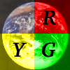
What is the difference between Screen, Addition and Lighten Only?
Screen, Addition and Lighten may appear very similar, sometimes almost as the same mode, but there are certain important differences. As Screen always wants a lighter color as result, it compares the FG and BG RGB-values, then chooses the higher value. So far it does the same thing as Lighten. Addition doesn't care about choosing, it just adds up all values. But now comes the difference - Screen is more subtle in treating color than Lighten. Simply put, Screen takes the Lighten color, adjusts it to the darker values so that they are not ignored and moves them up a bit on the RGB scale. This means that Screen color is darker than Add, but lighter than Lighten Only. The advantage of Screen vs. Add and Lighten is that Screen colors don't white out as often as Add (because 255 is often the result when adding up), and it allows more hues than Lighten does (because Lighten is seldom affected by dark colors, it'll just choose the color that is lighter in all RGB values if there is one).
Note, with process colors (CMYK or printing ink colors) as background (Cyan, Magenta,Yellow) the background color is the only color you're going to see in Screen, Addition or Lighten mode. FG-colors which contain the BG process color appear as if they were transparant, and FG-colors which don't, are simply treated as white (they don't show at all). The reason for this:
The RGB value of the process color Magenta is maximum for Red and Blue (Red 255, Green 0, Blue 255). If you take a look at Yellow, Cyan or Green, they all have maximum value for Green (255), so Magenta plus any of these equals White (max value for all three colors)! Now, Red, Blue or Black all have minimum values for Green (0), so Magenta plus any of these equals Magenta! As a matter of fact, all RGB colors with max values for Red and Blue are more or less saturated versions of Magenta, no matter what green value they have. Conclusion? All colors will end up Magenta. The more green they have in them, the paler the shade will be (until white) Check it out with the color selection dialog!
Overlay Mode
Overlay Mode is something of a combination of Screen and Multiply. In this mode all FGcolors appear in a paler, more washed-out shade. With a grayscale FG, you'll only see the background colors, but the important thing is, light and dark areas in the foreground affect the background by intensifying highlights or shadows. Overlay color depends wholly on the saturation in the background: Grayscale background gives very subtle colors even if the FG color is very loud, and loud colors in the BG are hardly affected at all by FG colors. White or black backgrounds are also not affected. Overlay Mode is good for both shadows and highlights. What it really does is change the Value (brightness) of your image, so you can "paint with light". Hue can be changed, but no more than a cold shadow or reddish sunlight would.
Difference Mode
Difference Mode In this mode no foreground color will ever replace the background. Foreground colors, however have a dramatic effect on background pixels. Black FG pixels have no effect though, they are transparant, but as color gets brighter the effect increases, white being the most powerful difference color. What Difference mode does, is to evaluate corresponding pixels in both FG and BG and change the image accordingly. Now, if we're talking of grayscale foreground pixels, this is easy. If the foreground pixel is brighter than the one in the BG layer, the background pixel gets inverted. If it's darker it keeps its color, but a greyish cast is added to it - the darker the grayscale pixel, the weaker this shade of gray gets. If the FG pixels are colored, the result is different. Now the foreground pixel is inverted instead of the background one. Then this inverted color is added to the background as in Multiply (colored glass or CMYK-blends).
This means that painting with a dark blue on top of magenta dots on white, will result in : 1. The inversion of blue, which is yellow in the RGB and HSV color systems. 2. It will be a pale yellow, because the inversion of dark is pale. 3. The final result will be red dots on pale yellow background, because yellow and magenta equals red and white plus yellow equals yellow (note, blends work like in Multiply here, not like in Screen).
Difference mode is usually very colorful, and can produce psychedelic results, if you like that sort of thing, but it is also a powerful tool for telling the difference between two layers. This becomes interesting when you want to compare the size, shape and relative position of grayscale masks in different layers. Where the result is black, the layers are identical, and any small difference will appear very clearly in this mode.
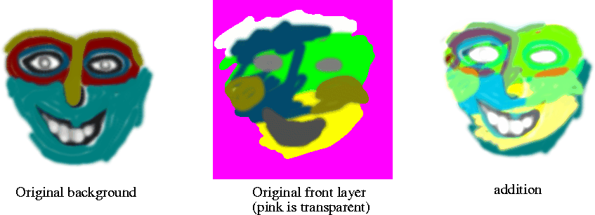
Addition Mode
Addition Mode is, I believe, a rest from the old Channel Ops before GIMP had layers. It is very similar to Screen Mode, and is built on the simple principle of adding the RGB values of foreground and background pixels. The result is always lighter and often results in white areas and unsharp edges.
Subtraction Mode
Subtraction Mode is the opposite of Addition. Here you subtract the foreground color from the background color - If your background is White (255,255,255), and you subtract Red (255,0,0), the result is (0,255,255) which is Cyan. White in the upper layer against a white background will for the same reason produce a black shape. It is as simple as that.
Darken only
Darken only is somewhat similar to Multiply. It is a mode where color can only get darker, but Darken doesn't work like two slides on top of each other. Here foreground and background pixels are compared, and Darken chooses the darkest RGB values in each channel. The result of choosing between a bright red (243,83,47) and a turqoise blue (47,239,201) would be: (47,83,47) - a dark moss green.
Lighten only

Lighten only is of course the opposite of Darken. If we choose the same example here, bright red and turqoise, the result would be: (243,239,201) - an eggshell bright beige. Lighten works by choosing the highest value of each pixel pair, and the result is always lighter (similar to Screen)
.
Hue
Hue mode makes it possible to change the color of an object without changing brightness or saturation. This mode acts on color alone. Your foreground color is the color you'll get, but you'll keep the general feeling in the image; a loud green on soft dark blue will be translated into a loud yellow on soft dark yellow. White, black or grayscale information in the background is not affected and cannot be tinted. Consider this if you wish to tint a background with complementary colors next to each other. Fuzzy blue dots on yellow means that somewhere around the edges there will be gray (on your screen, transparent blue on top of yellow doesn't turn green, it gets gray!), and your dots will look much like frog's eggs or germs in a microscope. Note that you cannot shift a color to grayscale in this mode either. Grayscale information in the foreground comes out as a scratchy red.
Saturation Mode
You can use any color you like in the foreground, background color doesn't change, only saturation, which assumes the same saturation as the foreground color. The hue can't be changed, exept for pure grayscale background which becomes shades of red if the foreground contains color. Because you can change saturation, this mode is often used with a grayscale foreground because this desaturates the background. Note, using black, white or gray makes no difference, what matters is that those colors have no saturation. So if you want to desaturate a selective part of your image, you'll need to paint a non-saturated color on a transparent or uniformly colored layer.
Color Mode
Color Mode will change both hue and saturation in an image. Black or white background pixels are not affected, but all other colors, grayscale or not will assume the hue and saturation of the foreground color. Color mode does not affect the Value (brightness) of the background. The dark and light information is left intact, but not hue or saturation. This is a nice mode for tinting grayscale photos if you want strong, clear colors, for a softer tinting (antique look) consider using Overlay instead.
Value
Value is the same as "Luminosity" in Photoshop. It doesn't change the colors (meaning hue; red green etc)of the background, but it changes how bright they are. As opposed to Overlay, this mode can't distinguish a dark red from a bright red in the background, it can't see grayscale background at all, nor can it add color in the foreground. Value is good for correcting overbright/dark or too loud colors, or it can be used to transfer patterns into an image, without changing the color of the image.
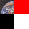
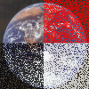
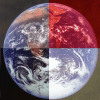
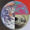
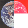
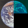
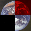
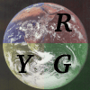
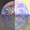
Comparing pictures in diffrent modes
[Top] [Prev] [Next] [Bottom]
karin@frozenriver.ale.se
Copyright © 1997, Karin Kylander
|