[Top] [Prev] [Next] [Bottom]
Paint Tools
The Color Picker

The color picker is used for choosing color. If you don´t want to use any of the Palettes available, you can just pick a color in your image (or in any other images opened in the GIMP), which gives you a huge spectrum to choose from. Just click at a color in an image, and this color will appear as Foreground or Background color in the bottom of the tool box.
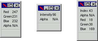
A small information box informs you of the RGB- and Alpha values of your chosen color. Alpha N/A means that your image contains no Alpha channel. (For more information on Alpha Channels read chapter 12). For a Grayscale image the information box displays an Intensity value ranging from 0 to 255, where 0 means black and 255 is white. An indexed image also has an index number for the specific color. Note that the Alpha value of an indexed image is either 0 or 255, there's nothing in between.
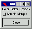
The color picker also has a "Sample Merged" option. Use this option if you have several layers in your image and you want to pick a color which represents the color you see on the monitor, not just the color in the active layer. Only color in visible layers are used.
Palettes
When you want to pick a color to work with, you can always use the color picker, but most of the time you'll be working with a color palette. You can choose one of the many ready-made palettes, but you can also create your own palette.
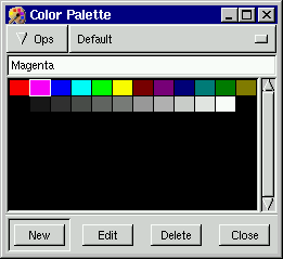
To do this, open the Color Palette in the File/Dialogs menu (or press Ctrl +P). You'll find a Default palette in the palette window, which contains some standard CMYK/RGB colors and a range of grayscales. To add your own colors to this palette, drag the color picker over your image until you find a color you wish to add to the palette (look in the foreground color square - you'll see the colors change as you drag).
When you find the color you want, click in the "New" button, and a new color square is created in the palette. You can name and save your new palette, and you can edit or delete colors. To use colors in a palette, you don't need to select them to the foreground color square with the picker, just click at a new color with whatever paint tool you're using at the time. More about palettes in chapter X
The Bucket fill

This tool will fill a selection with the specified foreground color. If you Shift-click, it will use the background color instead.
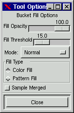
It will also fill a layer which already contains color and alpha information - but here the amount of fill depends on what "Fill Threshold"you have specified. The fill threshold works somewhat similar to the magic wand. It will start at the point where you clicked and spread outwards until it thinks the color or alpha gets "too different".
With the maximum threshhold value it will just fill the entire layer (you have to choose "Select all" to fill where Alpha=0).
In a feathered selection, the bucket will make a soft concentrical fill, which can be made more intensely filled if you click several times (you can even use different colors, they 'll blend softly into each other in an opalescent effect). You also have a "Fill Opacity" option, which determines how transparent you want the fill to be. There is also a "Mode" option (read more on Modes in chapter x), and a "Sample Merged" option. Sample Merged means that the Bucket fill reacts to the full composite image, and not just the active layer (but it will only fill in the active layer). The "Pattern Fill" button enables you to use the "Pattern Dialog" where you can choose to fill your selection with a pattern instead of a color.
The Blend tool or Gradient fill

This tool fills a selected area with a gradient blend of the (FG) Foreground and the (BG) Background color - this is the default gradient, but there are other options in the GIMP blend tool.
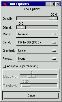
Besides the standard RGB option in Blend there is also the "FG to BG (HSV)" option, where HSV stands for Hue, Saturation and Value. HSV is a color model based on a 360 degree spectrum circle. This means that a gradient using HSV will not simply make a transition from red FG to blue BG by shades of violet. HSV starts with red, and follows the color circle clockwise with yellow, green and cyan until it reaches blue. The gradient will go clockwise (CW) if FG is in the right part of the semi circle, CCW if it's in the left part. 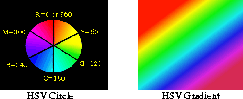
"FG to Transparent" only uses one color. It gradually changes the alpha value from 255 to 0, causing the color to get more and more transparant. "FG to Transparant" is very useful when working with softly blended collages or fog effects.
You can also choose use one of the many ready-made gradients, or make your own gradient in the powerful Gradient Editor, in the "Custom from Editor" option.
To make a blend you simply drag the marker in the direction you want the gradient to go, and release the mouse button when you feel you have the right position and proportion of your blend. The softness of the blend depends on how far you drag the marker. The shorter the drag distance, the sharper it will get.
The Offset option controls the fuzzyness of the blend, a high offset value gives a harder, sharper blending edge. Offset works for all gradient types, exept Linear and Shapeburst. The offset blend is a good choice if you want to make fluorescent, shiny or metallic objects in gradient shape.
There are no less than 9 different Gradient types:

The default type is Linear, which produces a smooth transition from one color to another.

Bilinear mirrors linear. By this I mean that Bilinear places the FG color in the middle, and then makes the transition to BG color both ways. The result is often something similar to metal pipes, especially if you drag a short distance.

Radial, as the name suggests, makes a radial transition from FG (in the middle) to BG (peripherical). The radial gradient type is necessary for certain gradients in the Gradient Editor, such as "Eyeball" etc.
-
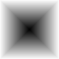
The square gradient produces a square blend, imitating the visual perspective in a corridor.
The effect of the symmetric and assymetric conical gradients is like looking at a 3D cone frome above.
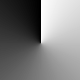
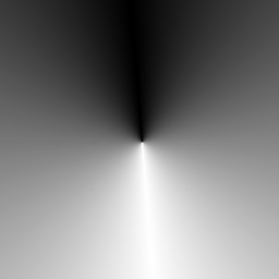
The assymetric conical gradient imitates a "drop shaped" cone, i.e. a cone with one sharp edge. The dragging distance is irrelevant for Conical gradients, what matters here is the point of departure (determines where the top of the cone is placed) and the drag direction (determines from which way the FG color (representing light or shadow) is coming from).
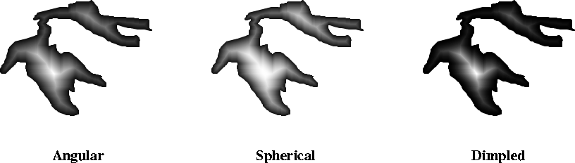
- The Shapeburst gradients are not affected by drag direction, distance or position. The purpose of shapeburst gradients is to give a defined shape (selection) a 3D-looking fill. You can see the different shapeburst gradients below. Spherical gives a flatter, rounder looking surface than Angular and Dimpled
.
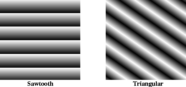
The repeat options: Sawtooth and Triangular allows you to repeat a gradient fill. The shorter the drag distance, the more repeats. The examples below represent Sawtooth and Triangular repeat on a linear gradient. Repeat cannot be used with conical or shapeburst gradients.
The Blend tool also has an Opacity option. Using a semi-transparent opacity value, and then dragging several times in different directions gives an interesting shimmering, bubbly surface to a background. Tip: Also check out the difference option in "Mode", where doing the same thing (even with full opacity)will result in fantastic swirling patterns, changing and adding every time you drag the marker.
Finally, the "Adaptive Supersampling" - an option which slightly improves the smoothness of the blend by adding a few new intermediate colors. The effect is quite marginal, though, unless in very small selections (especially when using shapeburst), with a gradient from the editor. More about the editor in chapter X.
The Pencil and Paintbrush

The Pencil and Paintbrush are very similar tools. The main difference is that although both tools use the same Brush Selection, the pencil tool is unable to produce fuzzy edges, even in a very fuzzy brush. If you want a more controlled drawing, use Shift. Shift - click lets you draw a straight line from one position to another. The Shift-click option also works for the eraser, airbrush, clone tool and convolver.
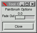
The Paintbrush also has a Fade Out option. Fade out means that a continous sweep of the brush, without releasing the mouse button, will cause the paint to get more and more transparent until wholly invisible - just as if you made a real brush stroke and ran out of paint. You will find more information on brushes in chapter X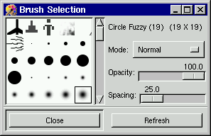
The Eraser tool

Just as you can paint with pattern shaped brushes in the Brush Selection, you can also erase with these patterns. This is a great way to create convincing texture effects, especially if you use it in many layers. A common tecnique to isolate a complex selection is to use the Eraser tool and just erase the background around the object's outline, then use the wand or lasso and easily select either the object or the surroundings and delete or cut it.
More amazing facts on the rubber! Floating selections are affected by the rubber tool so that erasing reduces the selection! If you choose Select Invert before floating, you'll increase the selection by this operation (provided you invert it back again of course). This happens because the rubber can affect alpha values in floating selections.
The Airbrush tool

It creates soft, semi-transparent spray strokes. There are two options in the Options dialog - Rate and Pressure.
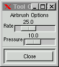
The Rate value decides how spray distribution follows movement. A low value gives a smooth, even brush stroke, no matter if you pause. With a high value this tool behaves more like a real airbrush - if you stop, the airbrush will keep pouring out spray and leave a darker stain where you paused. Pressure regulates how much paint there is in the "spray". Note that low pressure isn't the same as low opacity on the brush. Low pressure is more uneven, or "airbrushy" looking compared to the smoother appearance with high pressure and low brush opacity.
The Clone tool

The Clone tool gives you the possibility to paint with patterns or part of an image instead of just a solid color. To paint with a pattern fram the Pattern Selection dialog (see chapter X) you just click at the pattern you want and start painting.
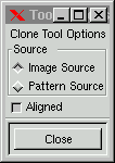
Use the Aligned option if you want a continous pattern, Aligned unchecked means that you paint a new part of the pattern every time you let go of the mouse button and start again. If you use the Image Source, it's important to know that in GIMP you use Ctrl instead of Alt (Photoshop) to choose the point of departure from your image source (just Ctrl-click at the part of the image you want to start your clone-painting from). You can choose to clone from a certain part of your image, you can even clone from one layer to another, or you can clone from another image.
Needless to say, the Clone tool is the ultimate retouching instrument. If you, say, would like to retouch a birthmark from a face, it would be hard, almost impossible to imitate the complex color varieties of skin texture with regular paint or blends. The cloning of skin in another part of the face is the only way to make it look good. I'm not saying that cloning is easy though, to make it look convincing you may well have to clone from different directions, with different brushes, and maybe even in different layers with appropriate opacity and "Mode".
The Convolver

The Convolver's blur option is somewhat similar to "Smudge" in Photoshop, though not quite so smeary. It softens sharp edges and blurs whole areas as you paint.
It always blurs to dark, and never to a lighter color. "Blurring" transparent areas with convolve will only transform them to opaque color. The convolver will use the nearest color and smear it to full opacity.
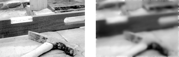
The Sharpen option doesn't really sharpen in the traditional meaning, it is too "dotty" or "pixly" for that. If you want to sharpen up something out of focus, it's better to use "Sharpen" in the Image menu. Convolver sharpen will, however, produce some very interesting graphic results (especially in a grayscale image) resembling engravings, prints or ink drawings.
Another oddity about this tool is that it will sometimes blur out of hue. A"swimming pool blue" color (45,230,247) on white background gets an almost violet blur color. This probably occurs because the convolve tool uses RGB values. To go from a color with high values for green and blue but low for red, to a color (white) with maximum value for all colors, means that the intermediate colors will get lighter, but they will also get visibly redder.
Brush Selection
It belongs not only to Pencil and Paintbrush, but also to the Eraser, Airbrush, Clone tool and Convolver. You'll find the Brushes in the File/Dialogs menu in top of the Tool box, or in the Dialogs item in the menu you get from right clicking in you image. You'll find a variety of brushes. Note that brushes may have any shape! Besides the "Mode" and "Opacity" options there is a Spacing option where the brush stroke can be decomposed to a line of individual brush shaped objects. If you like, you can make you own brushes and add them to the Brush Selection dialog. You can also see chapter X.
The Foreground/Background icon

The last tool in the toolbox is the Foreground/Background color "tool" The foreground color is the color you use to paint or fill with. The background color is the color you'll get if you erase or cut a piece of your image. The double arrow symbol swaps foreground and background colors.
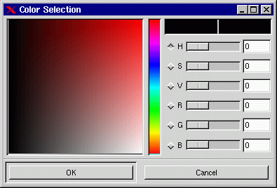
Clicking in the foreground or background icons brings up the Color Selection dialog, where you can easily change to another color.You can do it manually, by clicking at the hue you want in the spectrum box, and then specifying further by dragging the cross in the large color box to the exact color you want. If you want a specific RGB or HSV-color, you can type the exact value in the HSV or RGB parameter squares. There are also other ways to find the color you want. You can try under (S) for saturation, (if you're after pastel or neon colors for instance) or under (V) for value (washed out or gloomy colors). You can also search in the Red, Green or Blue spectrum for the shade you want.
[Top] [Prev] [Next] [Bottom]
karin@frozenriver.ale.se
Copyright © 1997, Karin Kylander